Typo Roma
Typography + Branding
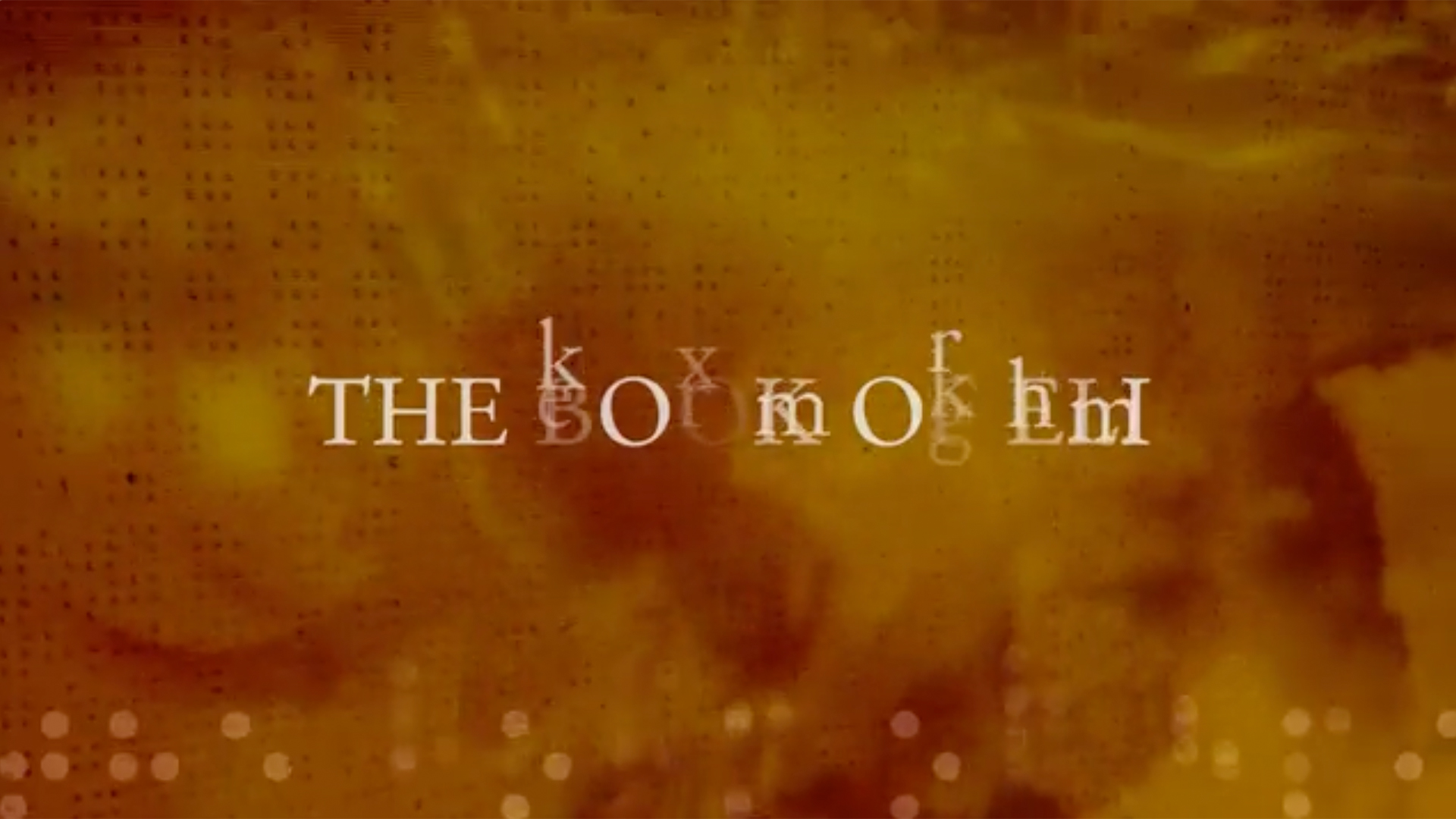
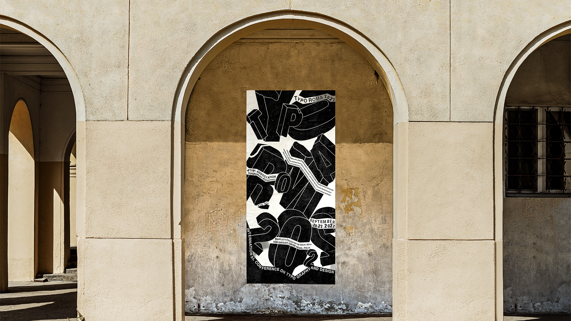
For this large-scale print project, I developed the design as part of the visual identity for a conference organized by the Association Typographique Internationale (ATypI). I looked to the Roman Forum as a central source of inspiration, so I used bold, heavy letterforms to echo the strength and permanence of its architecture. I then pushed the composition by arranging the type so it appeared to break apart and collapse, visually referencing the fragmented ruins of the Forum while introducing a sense of motion into the layout. For the secondary type, I placed text along the edges and paths created by the fractured forms. This created a layered composition that guides the viewer’s eye while reinforcing the concept of past and present coexisting. It mirrors the experience of walking through ancient ruins and imagining their original form. Overall, the use of bold typography, texture, and structural composition allowed me to create a modern yet historically grounded design that aligns with ATypI’s focus on typography.